Overview
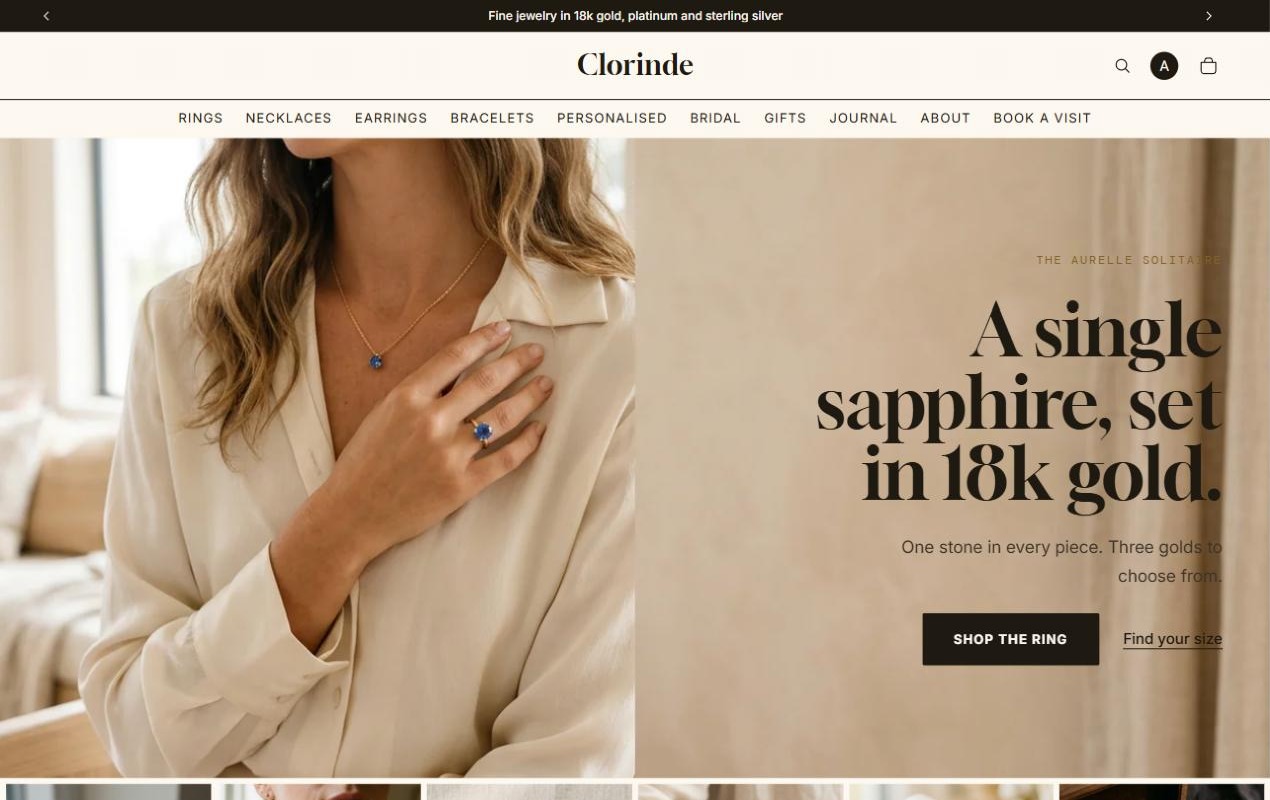
Clorinde is a fine jewelry atelier I built to answer a different question: how do you get someone to spend thousands on a ring they can't hold?
The result is an editorial Shopify storefront in gold, platinum and silver that reads like a printed catalogue, and answers every question a shopper has about metal, size and engraving before they reach the cart.
The Challenge
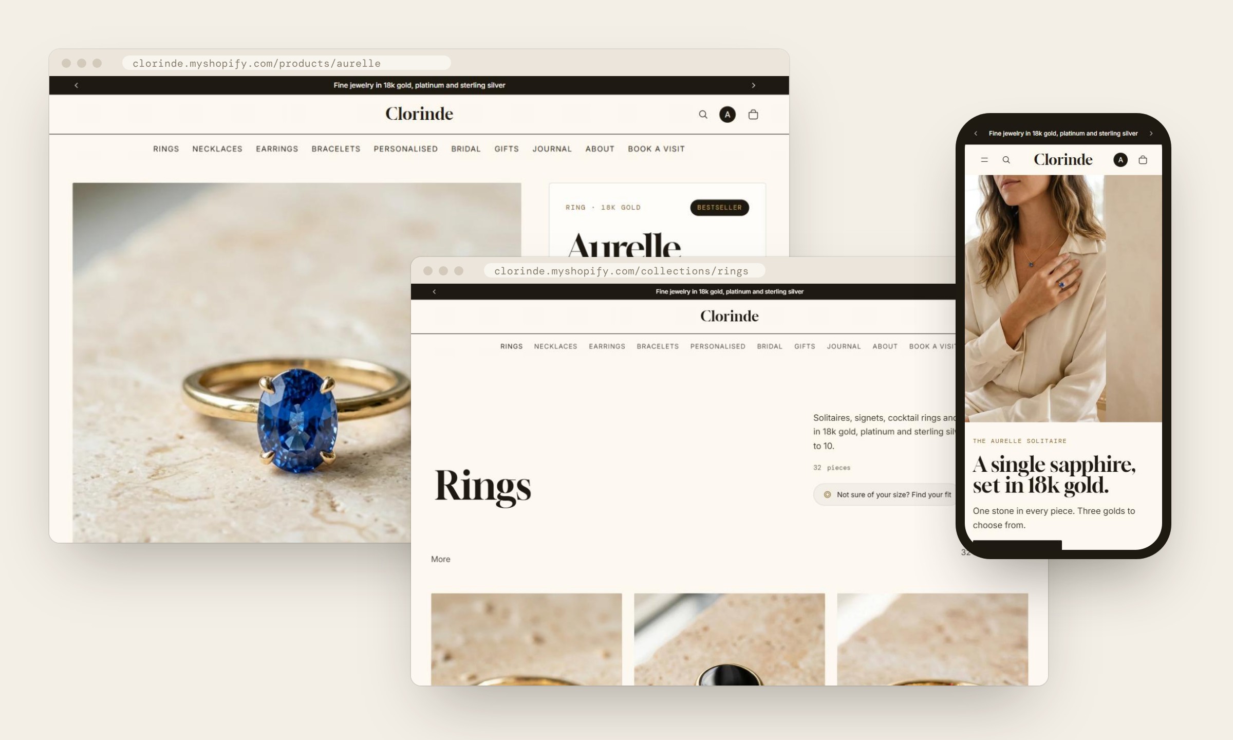
Fine jewelry is a trust purchase. Pieces in the store run from a $240 silver signet to rings well over $5,000, and most of them come in several metals, ring sizes or with an engraving.
Online, every one of those choices is a reason to hesitate. Will the size fit? What does white gold actually look like next to platinum? Can I return an engraved piece? Luxury design often makes this worse: thin grey type, hidden details and very little information. The brief I set myself: keep the store calm and expensive-looking, but make it the most informative jewelry page a shopper has seen.
The store also started life as a makeup brand. Rebuilding it as a jewelry atelier meant replacing the catalogue, the content and the whole visual system on a single theme, without touching the live one.
Approach and key decisions
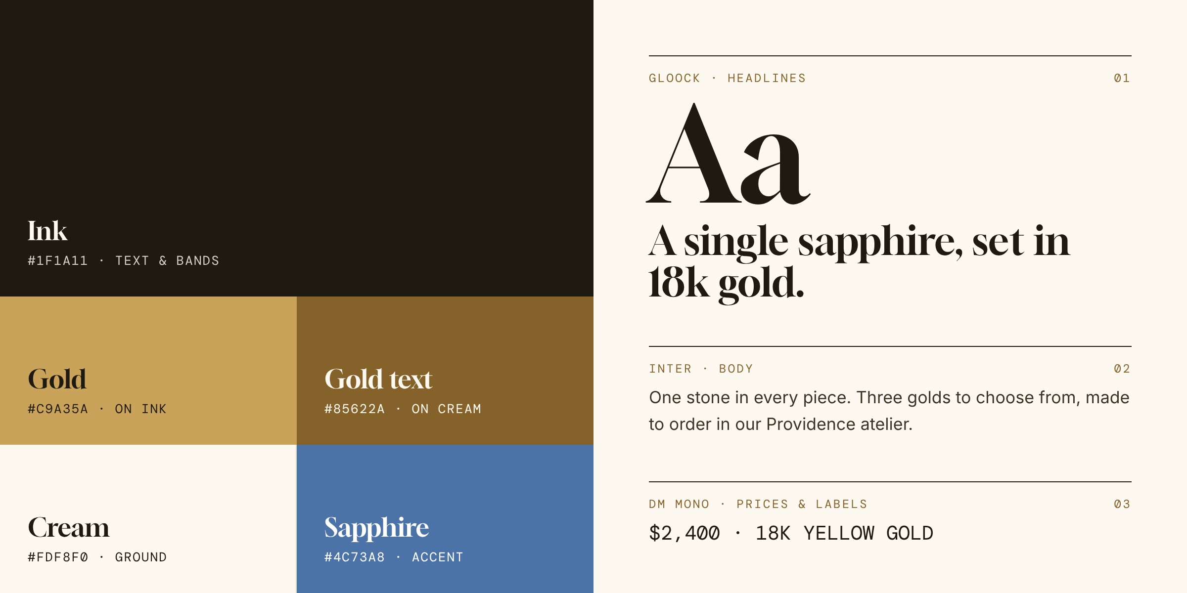
Luxury here means restraint. The type and the photography carry the brand; every other element exists to answer a question.
Gold with rules
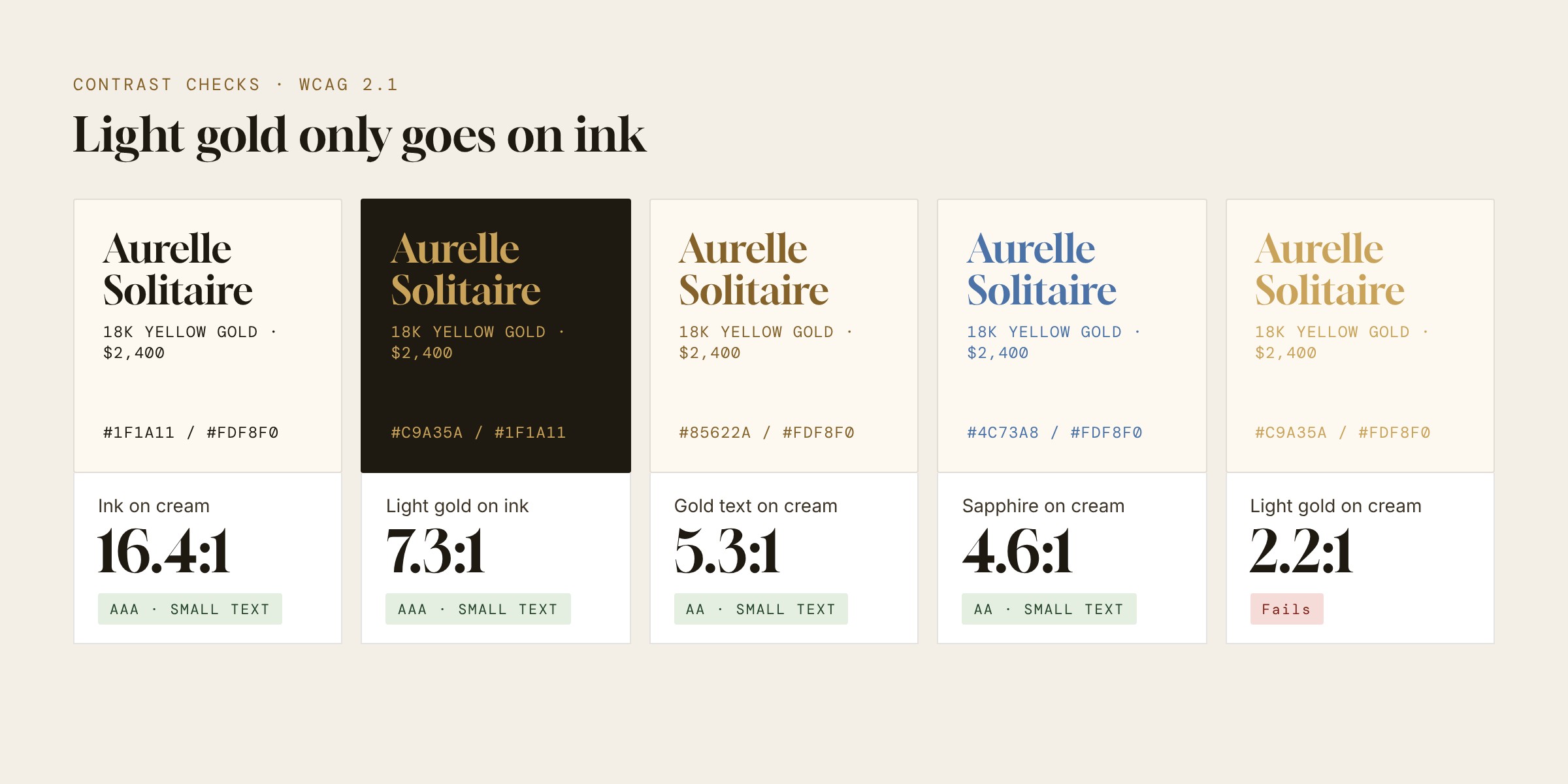
The bright gold that reads as "jewelry" only reaches 2.2:1 on the cream background, so it never appears as text there. It's used on the dark ink bands, where it passes at 7.3:1, and on gold buttons with ink text. On cream, small gold text switches to a deeper #85622a at 5.3:1. I checked every pairing with Adobe's color contrast analyser.
A product page that answers before it asks
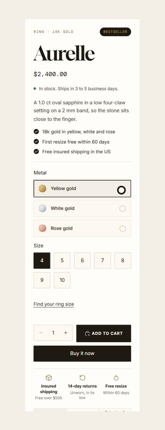
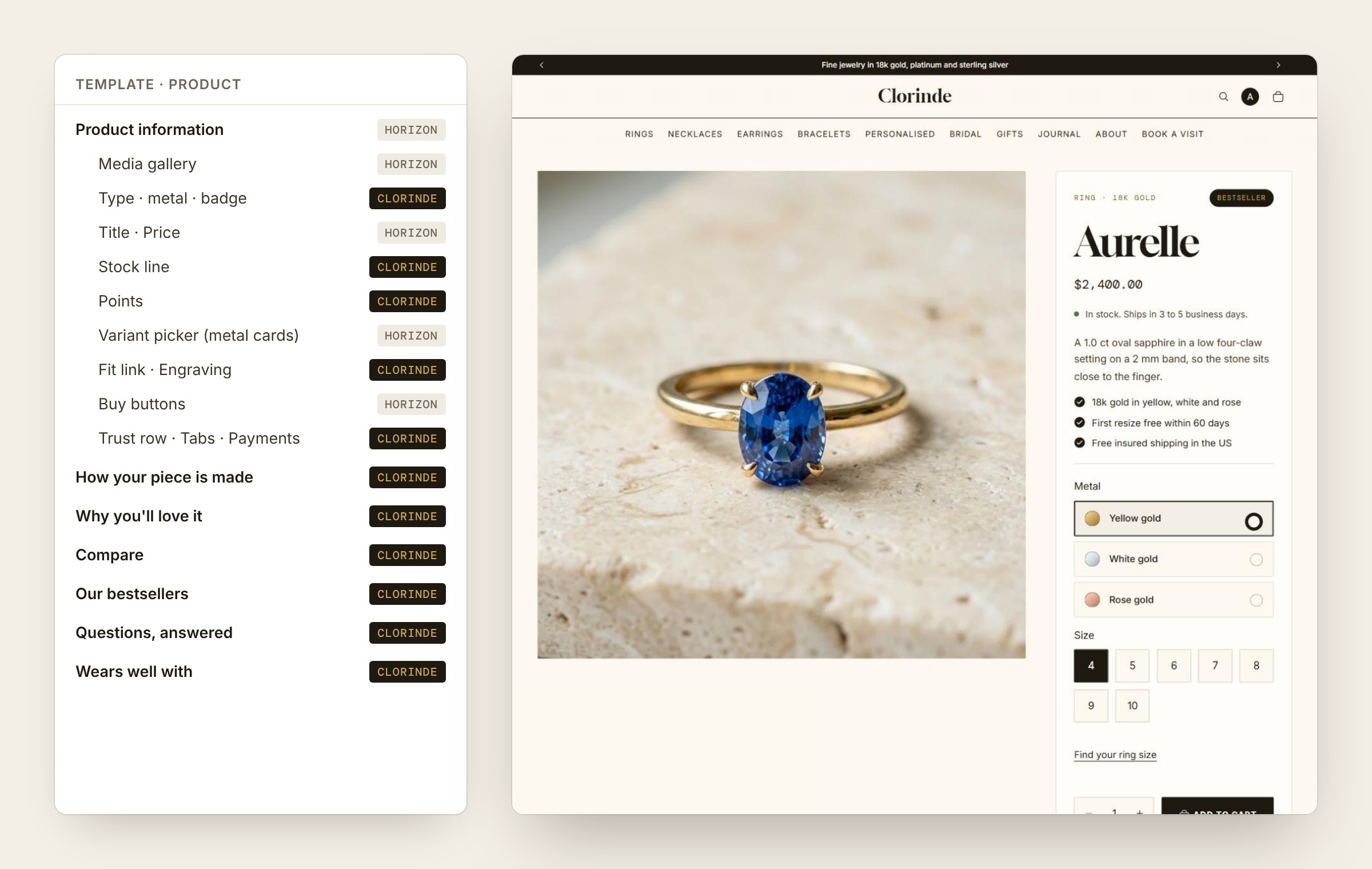
The buy card shows the metal as cards with real colour swatches, so shoppers see yellow, white and rose gold side by side before choosing. A stock line reads the selected variant's actual inventory: "Only N left" at three or fewer, otherwise a ship time that adds five days for engraved pieces. Ring sizes link straight to the fit guide, and the engraving field sits right above Add to cart.
Below the buy card, a comparison table lines the piece up against two others from the same collection, and a tabbed FAQ covers the piece, care, and shipping and returns. I deliberately left out star ratings, reviews and "expert" quotes: a concept store has none, and inventing them would undermine the trust the page is built to earn.
Help for the hardest decisions
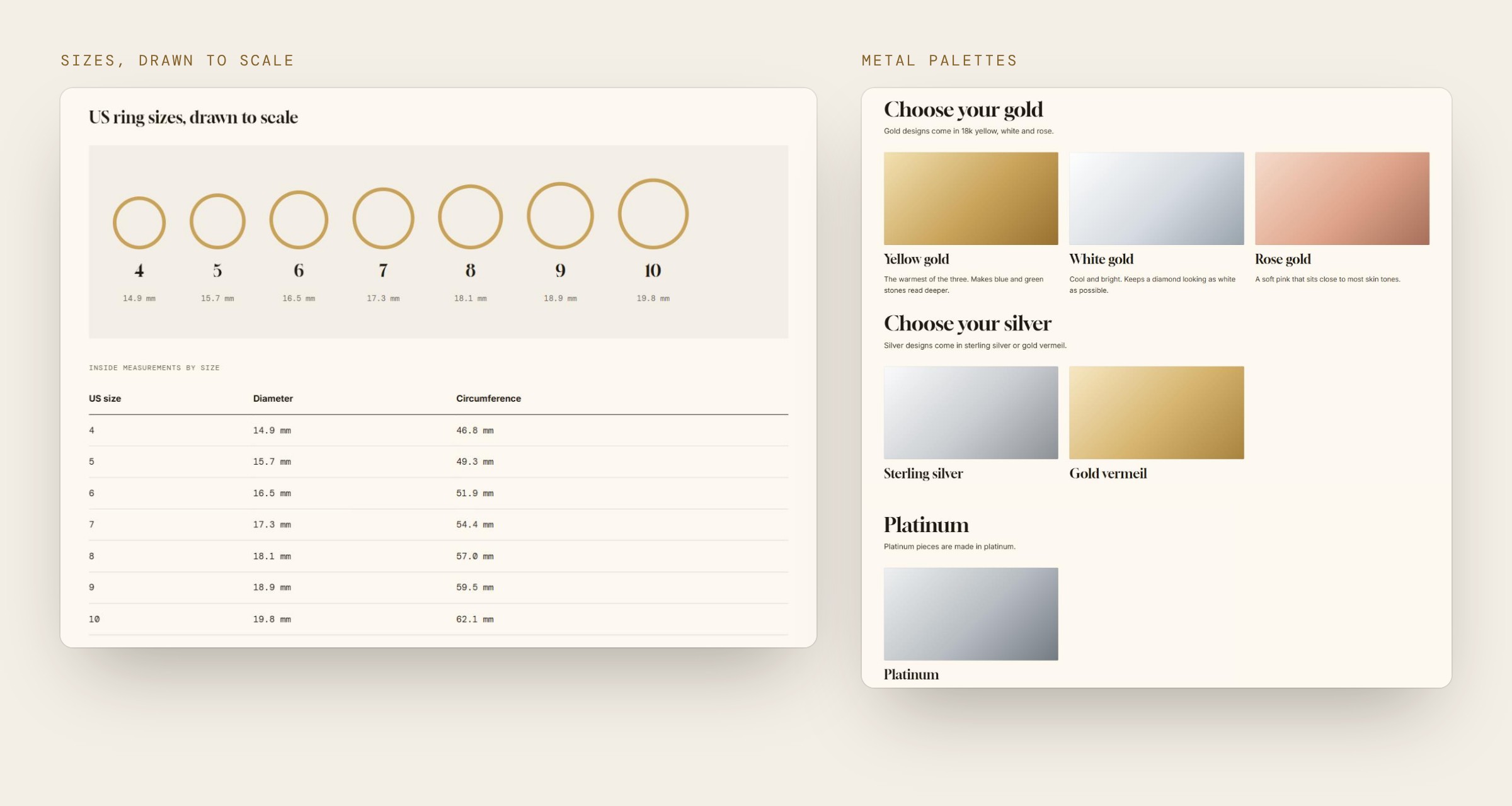
Ring size and metal are where jewelry shoppers stall, so they get their own page. "Find your fit" has printable ring outlines, a US 4 to 10 size table, a paper strip method and three metal palettes. Shoppers who are still unsure can use the gift finder, or request a visit to the atelier through a booking form. On larger collections, a dark editorial tile after the first row points to that booking page.
One metal colour system
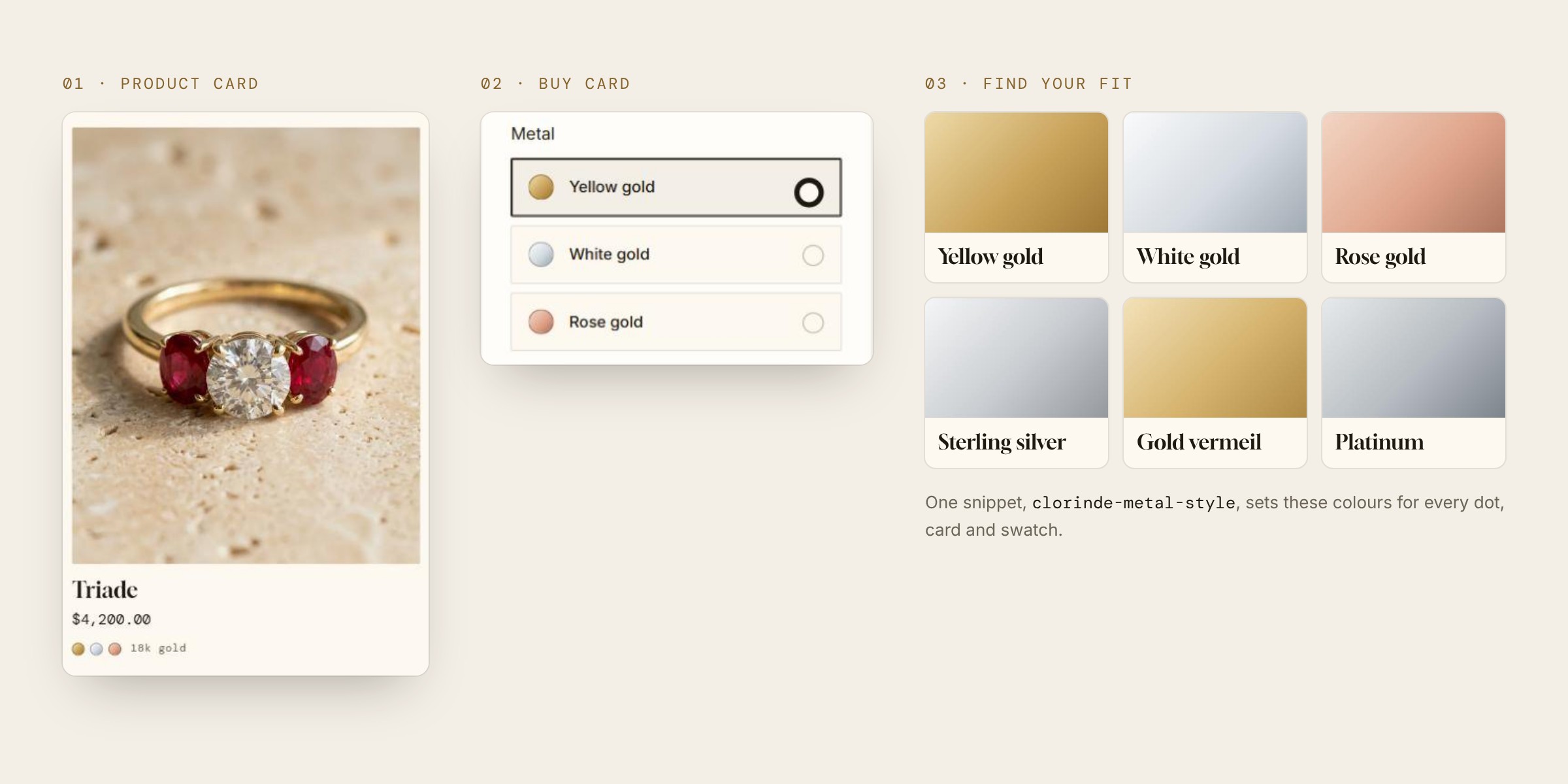
Metal shows up everywhere: dots on product cards, the comparison table, the product page cards and the fit guide. A single shared snippet defines the six metal colours, so yellow gold looks the same on a collection grid as it does in the buy card.
Branded to the last step
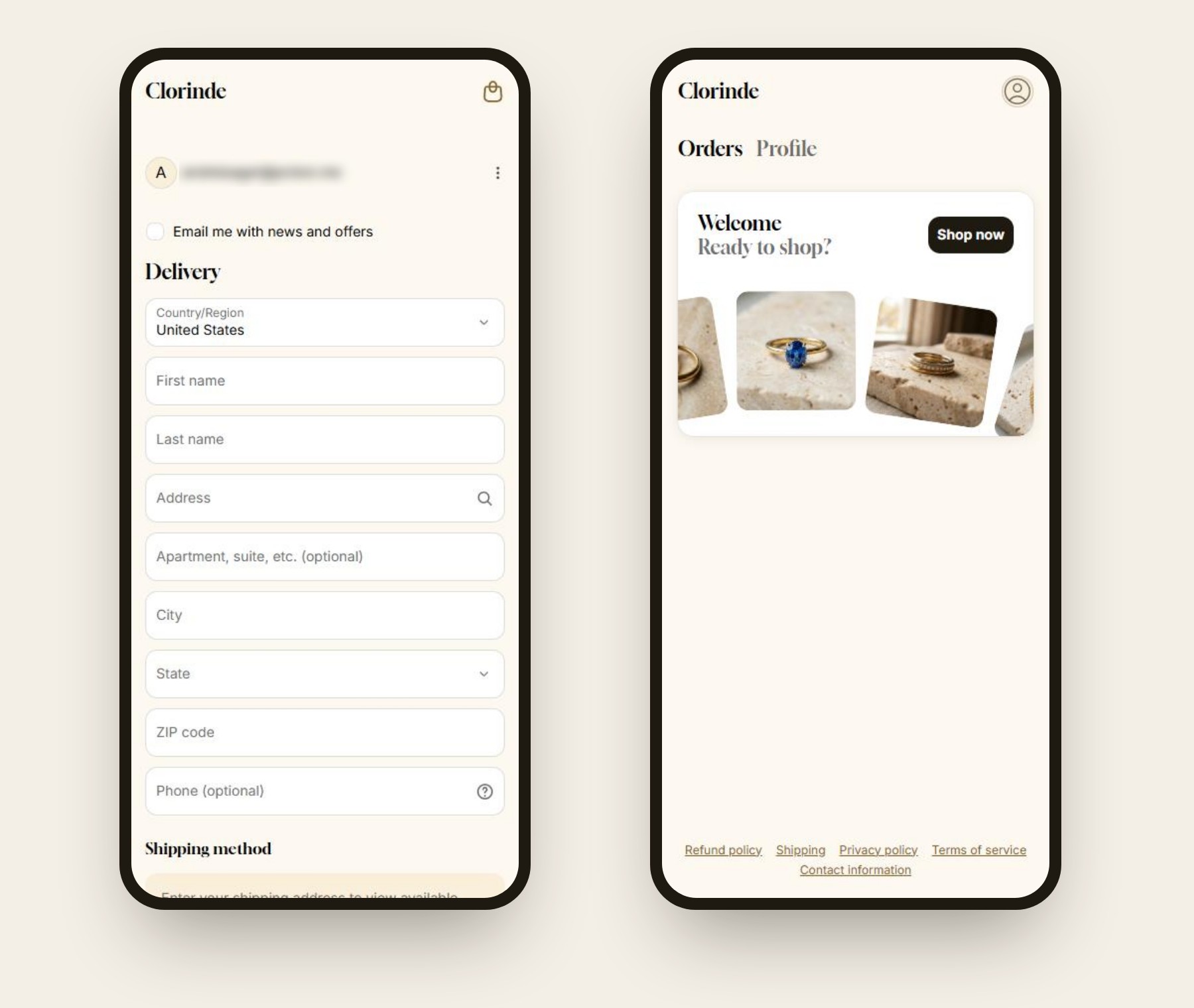
The experience doesn't drop back to Shopify defaults at the end. Checkout, customer accounts, the password page and the gift card page all use the Clorinde fonts, cream ground and ink buttons, so the last screen before payment feels like the first.
Under the hood
The storefront runs on Shopify's Horizon theme (Online Store 2.0), extended rather than rewritten, so it can keep taking Horizon updates.
- Section architecture: 38 custom sections and 8 theme blocks, all editable in the theme editor. The product page is built from blocks, so the merchant can reorder the buy card without code.
- Minimal core edits: only three lines in one Horizon file were changed, to place the editorial tile in the collection grid. The metal cards restyle Horizon's own variant picker with CSS.
- Real data only: stock lines read live inventory, the comparison table and checks are built from each product's own data, and "Wears well with" uses Shopify's related products.
- Automatic collections: an 18k gold collection gathers any piece with a gold variant, and three price bands sort the catalogue by budget, so 100 products stay organised without manual upkeep.
- Accessibility: keyboard tabs, a pause button on the scrolling marquee, and motion that respects reduced-motion settings. Every page was checked at 1280px and 390px with no sideways scrolling.
Outcome
Clorinde is a concept project, so there are no sales figures to report. Here's what the build delivers:
- 38Custom, merchant-editable sections
- 8Custom theme blocksStock line, trust row, tabs, engraving and more
- 20Page templates designed
- 0Paid apps needed
The takeaway for a brand: a luxury store doesn't have to choose between looking quiet and telling shoppers everything they need to buy.
Want a storefront that feels this considered and sells with this much clarity?
Let's talk about your store.