Overview
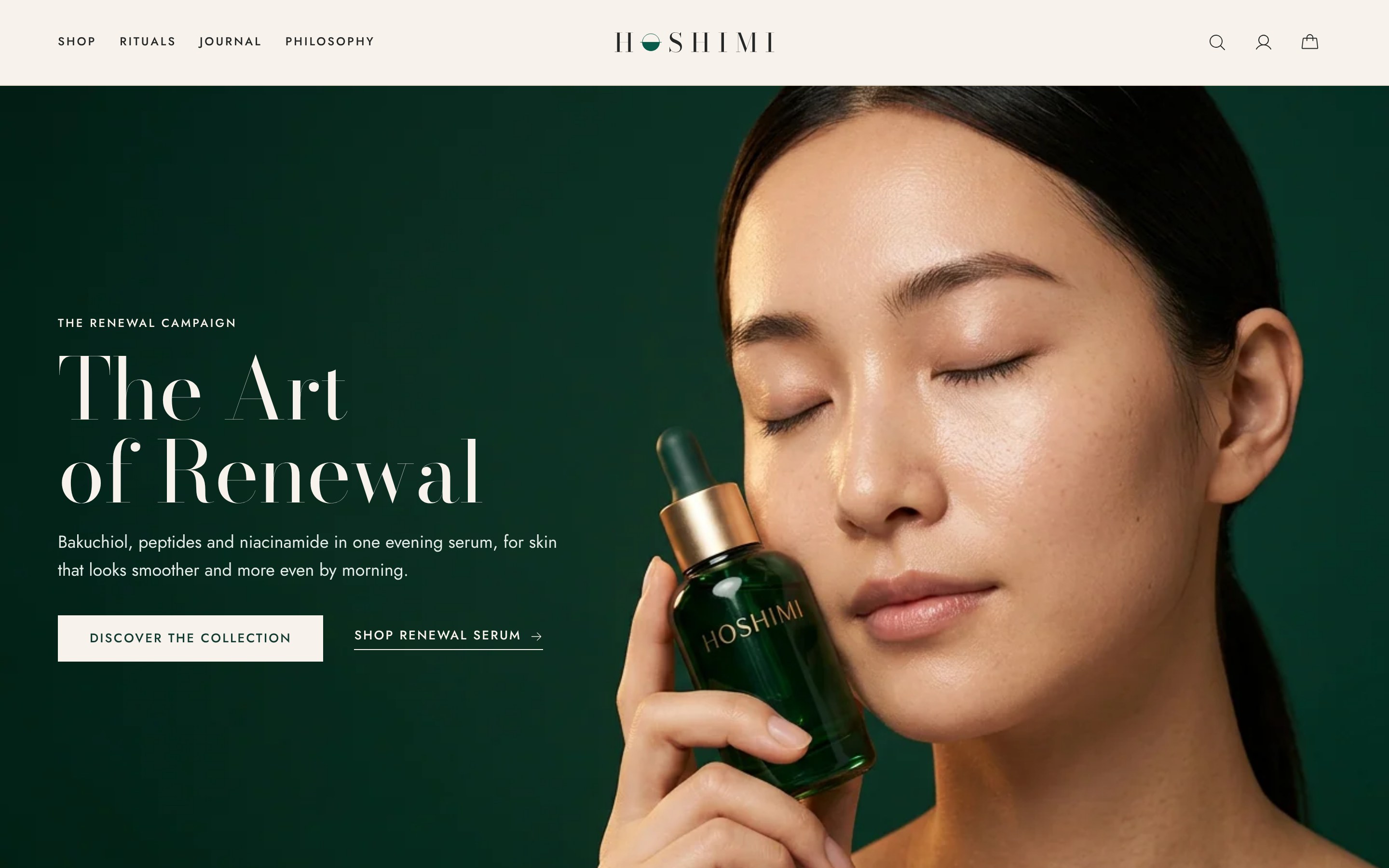
Hoshimi is a prestige beauty brand I built around one idea: skincare is bought for a moment in the day, not just for a product type. Every product belongs to "The Hour", a morning or an evening ritual.
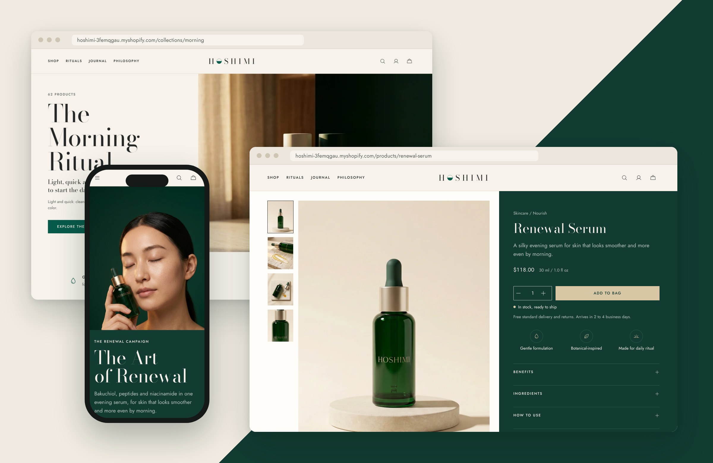
The result is a custom Shopify storefront that feels quiet and luxurious, but still tells shoppers exactly what each product does, when to use it and what to pair it with.
The Challenge
Luxury beauty sells on restraint: generous space, soft imagery, very little noise. But skincare shoppers also need detail. Which step is this? Is it for morning or night? What's in it, and what goes with it?
The risk is that restraint turns into vagueness, and detail turns into clutter. The brief I set myself: keep the calm of a prestige counter, but answer every question a shopper would ask a beauty advisor.
Approach and key decisions
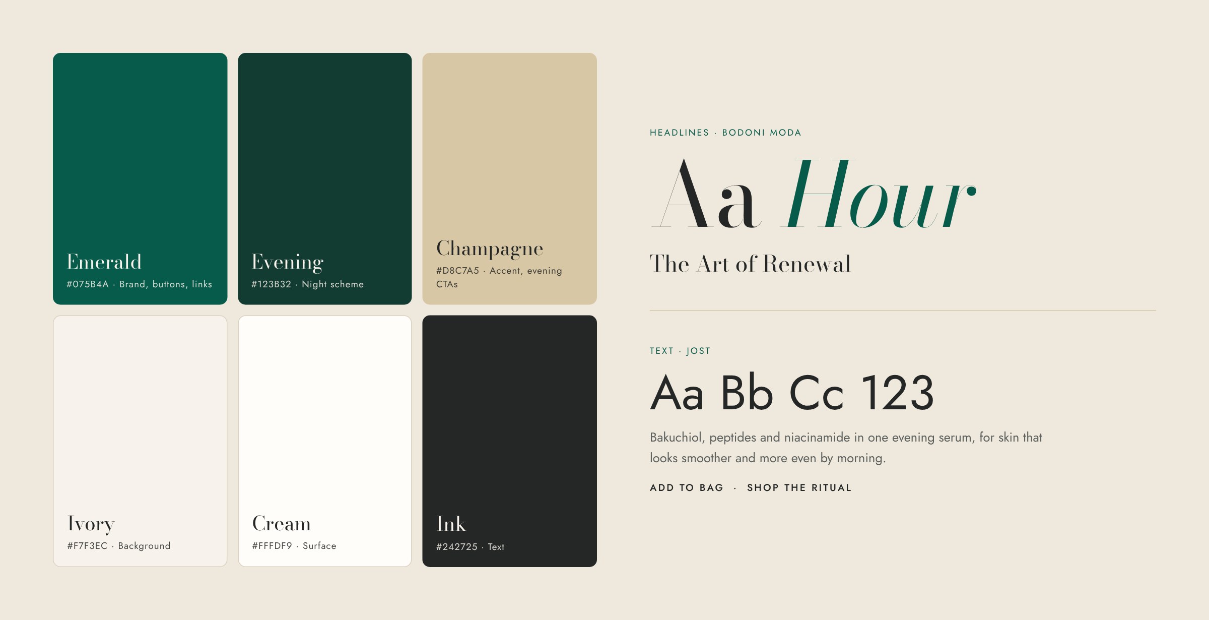
Every element had to feel considered. Color and space carry the luxury; structured product data carries the detail.
Shop by the hour
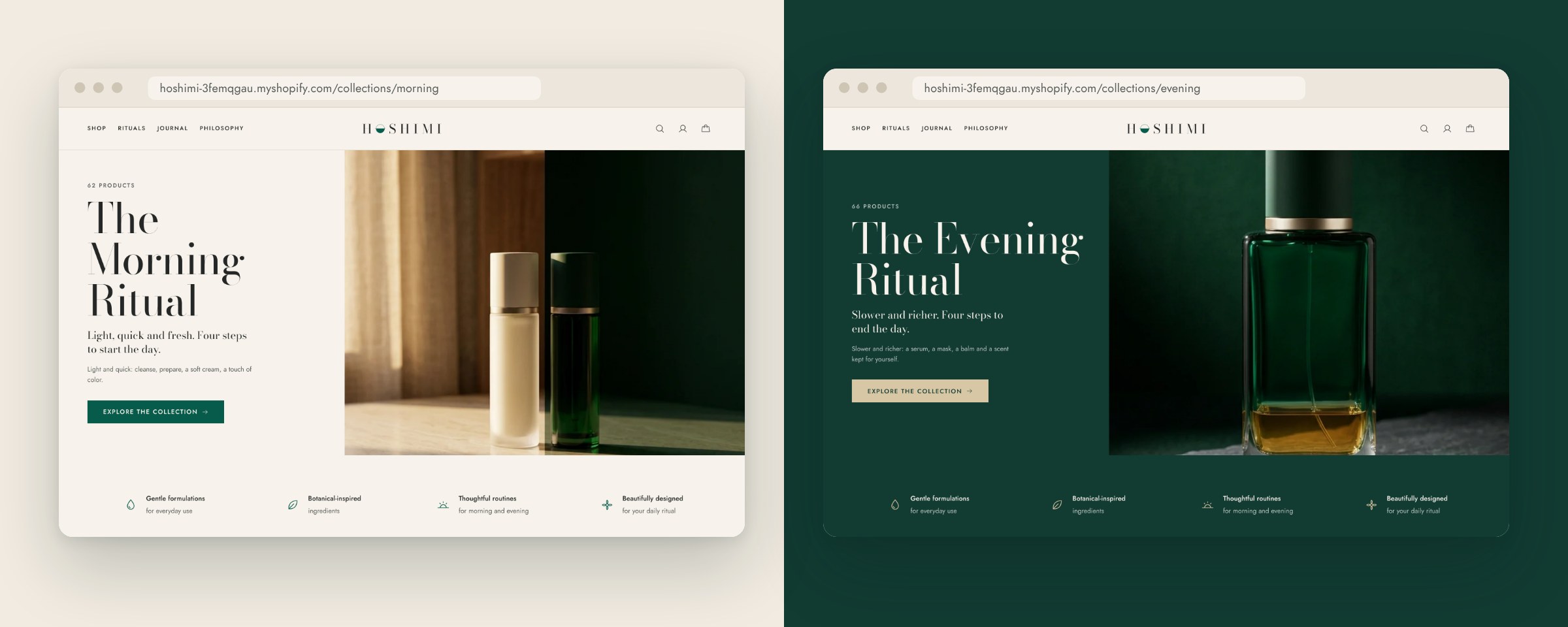
Products are organized twice: by category (Skincare, Lip Beauty, Fragrance & Body) and by ritual (The Morning Ritual, The Evening Ritual). A ritual-time metafield tags each product, so the same cleanser can appear in both routines without duplicating anything.
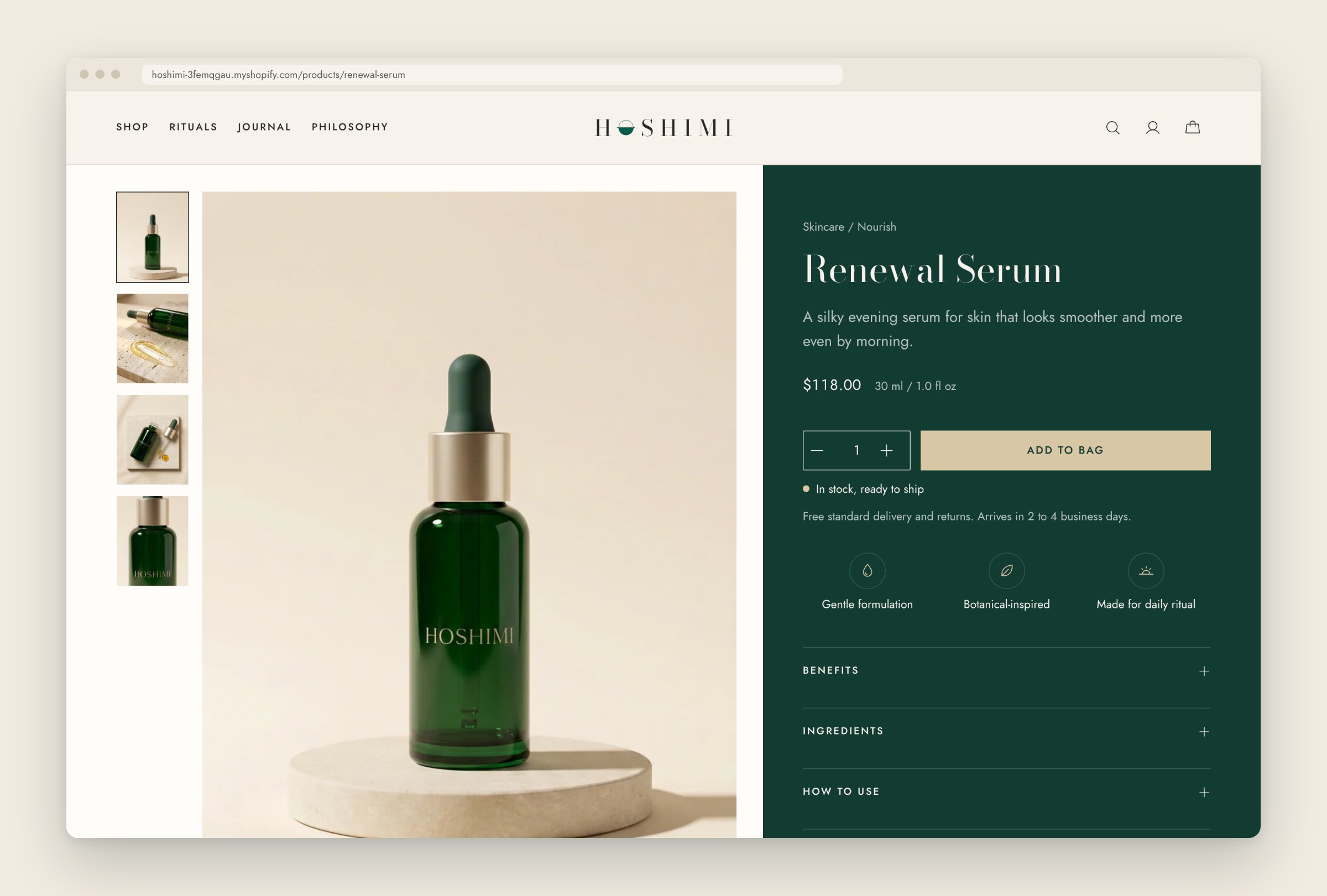
A product page that answers like an advisor
Each product page shows its ritual step, a short intro, key benefits, texture and finish, and how to use it. Key ingredients and fragrance profiles are structured metaobjects, so they stay consistent across every product that shares them. A pairing block suggests what to use next, with a short note on why.
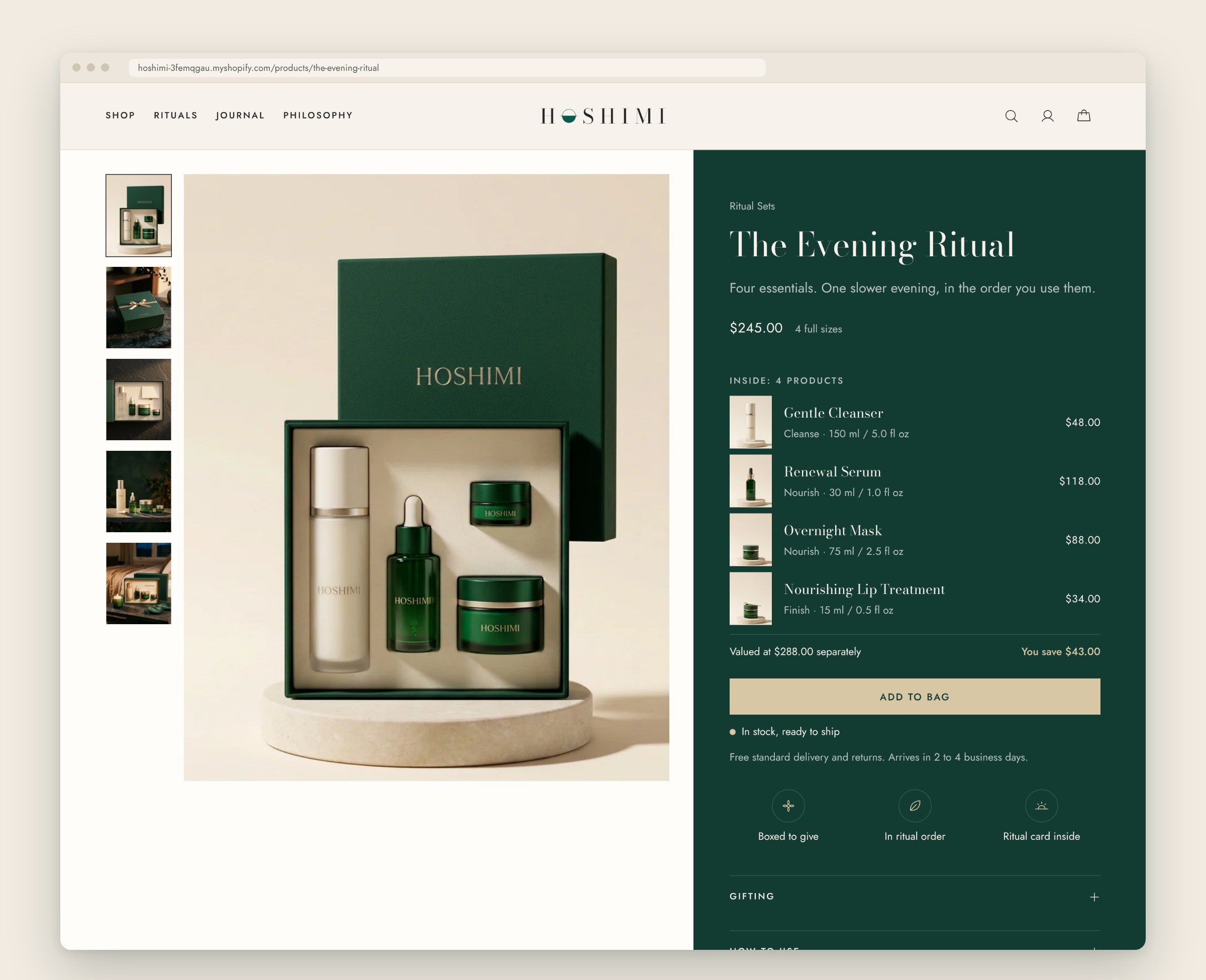
Ritual sets that show their value
The four ritual sets (Morning, Evening, The Essential Collection and The Discovery Set) list every product inside them and show what the set saves against buying each item separately. Both come from metafields, so the merchant updates a set once and the page follows.
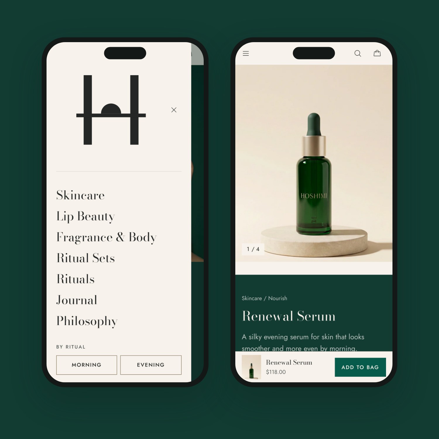
Mobile first
Beauty shoppers often browse on their phones between moments of the day, so I designed the mobile view first. Navigation and add to bag sit within thumb reach, and product detail folds into tidy sections instead of one long scroll.
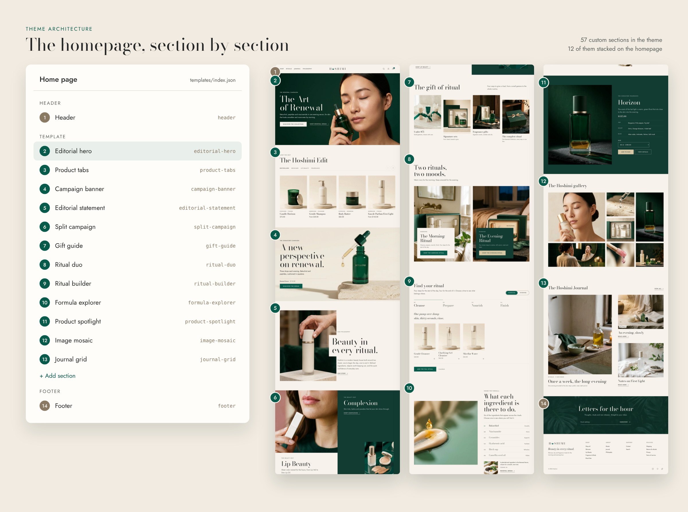
Under the hood
The storefront runs on a Shopify Online Store 2.0 theme, structured so it stays fast and easy to maintain.
- Section architecture: reusable sections and blocks, so new pages are assembled in the theme editor rather than coded.
- Metafields and metaobjects: 15 custom product fields cover ritual time and step, benefits, how to use, texture, size, pairings and set contents. Ingredients and fragrance profiles are metaobjects, written once and reused across products.
- Performance: lazy-loaded images with responsive sizes in every custom section, and small, vanilla JavaScript only where something needs to move.
- App-free features: ritual filtering, product pairings, set contents and savings, and structured ingredient details, all built into the theme.
Outcome
Hoshimi is a concept project, so there are no sales figures to report. Here's what the build delivers:
- 13Custom, merchant-editable sections
- 15Custom product fieldsRitual, benefits, pairings, set contents and more
- 20+Products across 4 categories
- 0Paid apps needed
The takeaway for a brand: a luxury store can stay calm and still give shoppers every detail they need to buy with confidence.
Want a storefront that feels this considered and runs this smoothly?
Let's talk about your store.