Overview
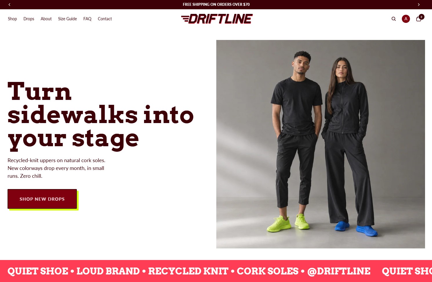
Driftline is a sneaker brand I built to answer one question: can a bold, graphic identity still deliver a clean, fast shopping experience?
The result is a custom Shopify storefront that leads with attitude but never makes shoppers work to find a size, check stock, or check out.
The Challenge
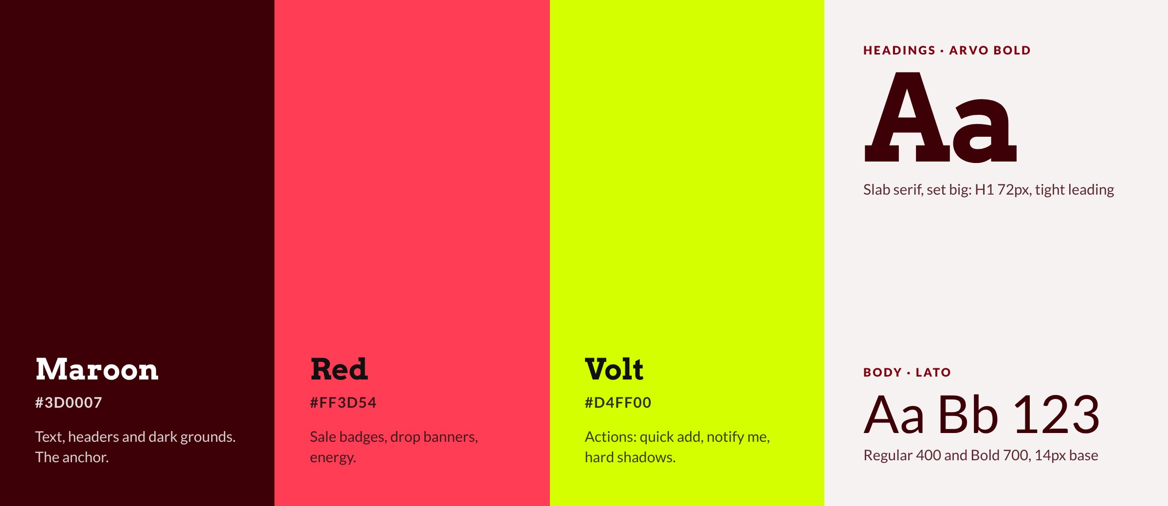
Gen Z streetwear sells on energy. Driftline's palette is maroon, electric red and volt yellow, and the brand voice is loud on purpose.
The risk is that loud turns into chaotic. Busy layouts, low-contrast text and competing colors hurt readability, and they hurt conversion. The brief I set myself: keep every bit of the attitude, but make the path from homepage to checkout feel effortless.
Approach and key decisions
Every design choice had to earn its noise. Color and type carry the brand; layout and interaction stay calm.
Color with rules
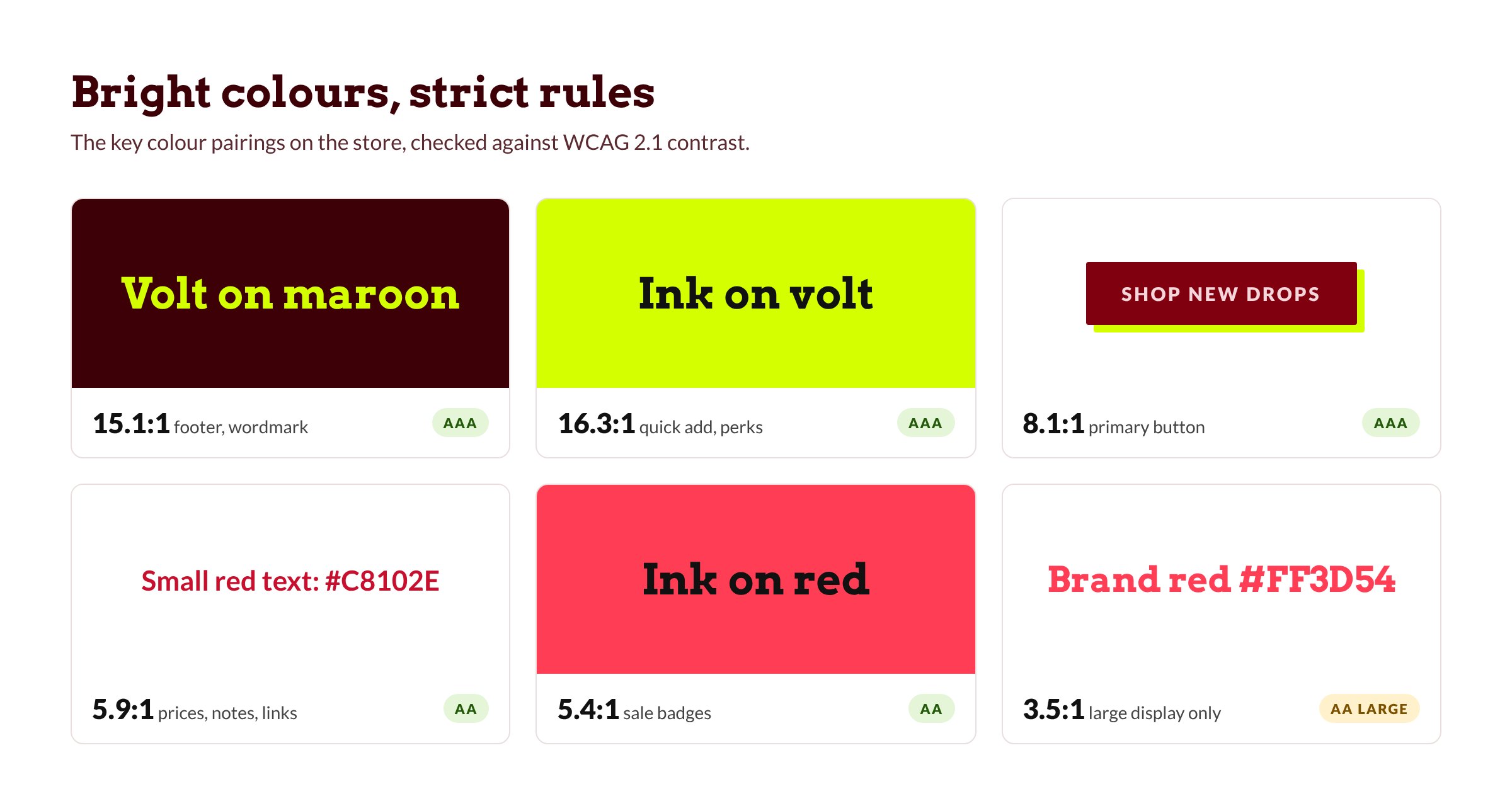
Volt and red are reserved for actions and moments that matter: add to cart, sale badges, drop announcements. Maroon anchors the backgrounds so the bright colors pop without fighting each other. I used Adobe's color contrast analyser to make sure the colors meet accessibility standards.
A product page built for drops
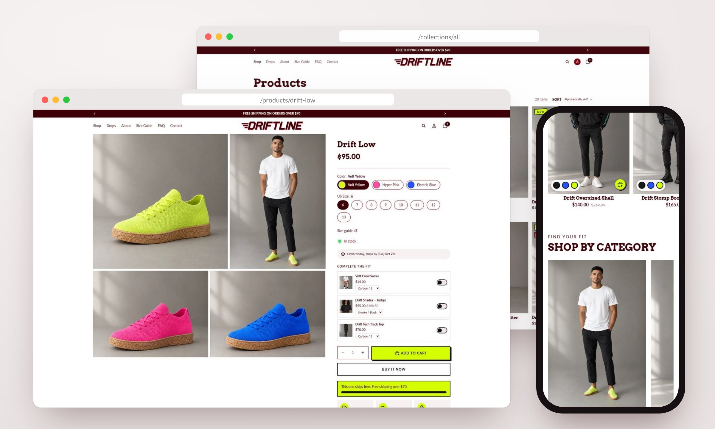
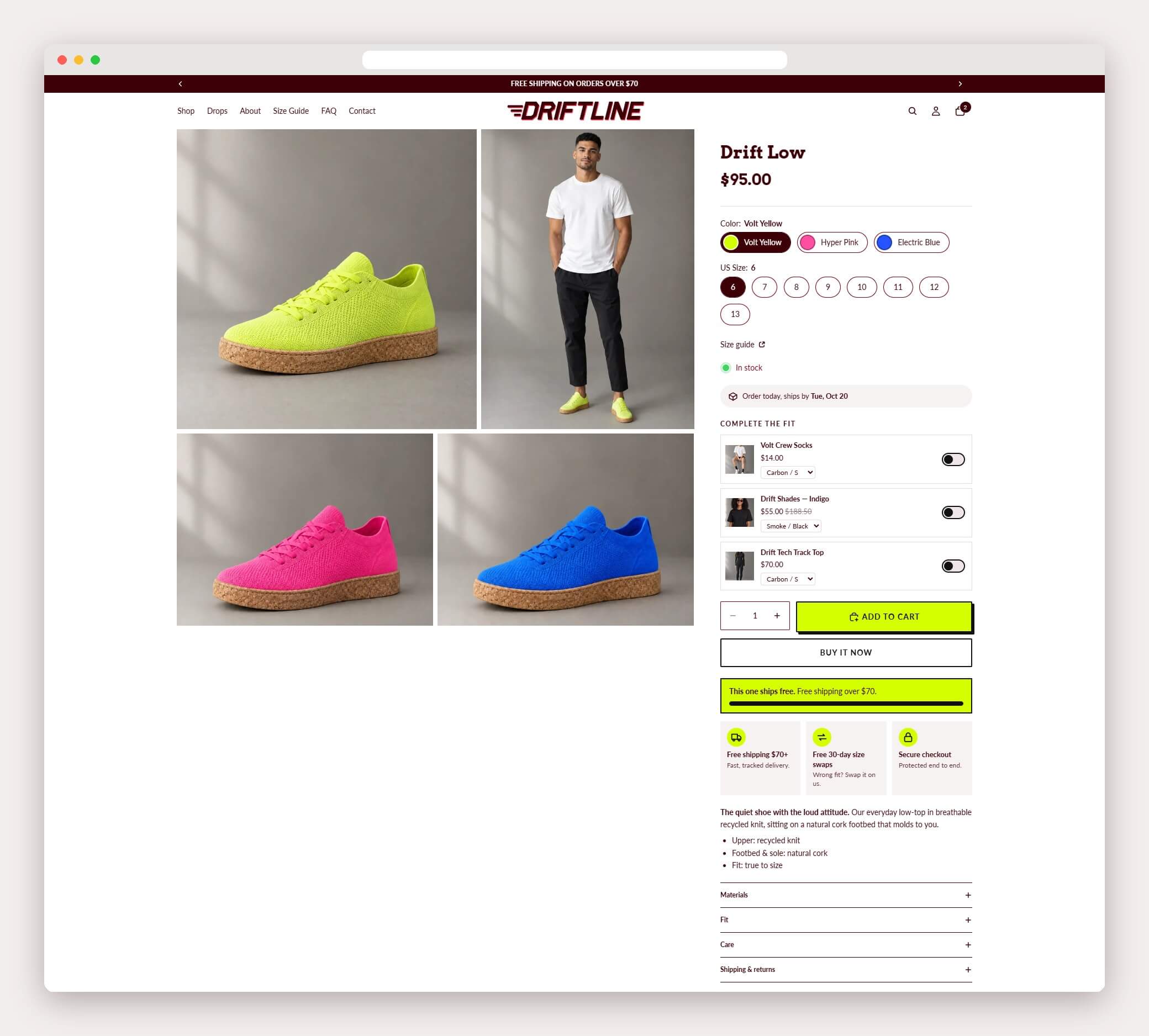
The size selector shows every size at a glance, with sold-out sizes clearly marked instead of hidden. When a size runs short, a low-stock note appears once five or fewer pairs are left, and a ships-by date sits right underneath it. Shoppers know what's available before they tap, which cuts frustration on limited releases.
Custom sections the merchant controls
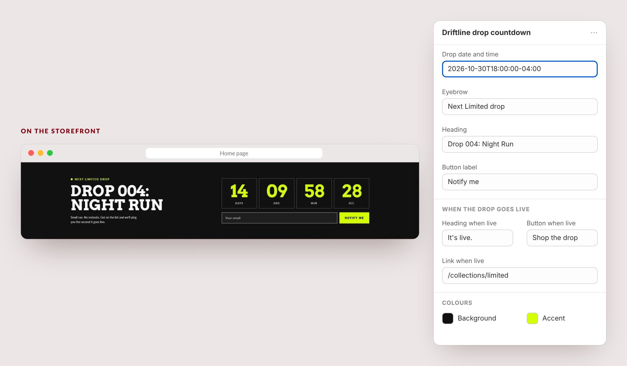
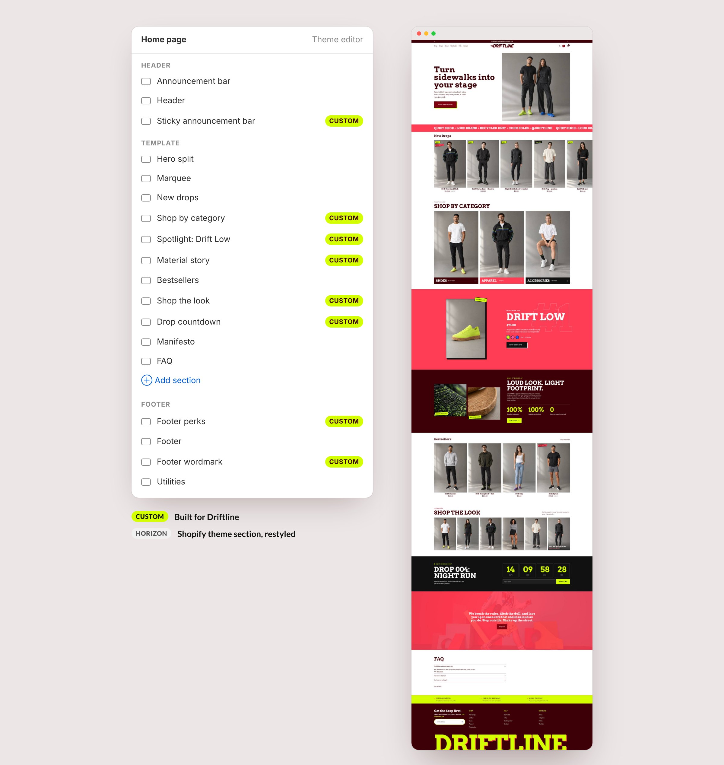
I built 15 custom sections, including a drop countdown that flips to a “Shop the drop” button the moment the timer ends, a shoppable lookbook and a product spotlight. Each one exposes simple settings in the theme editor, so the merchant can launch a new drop without touching code.
Mobile first
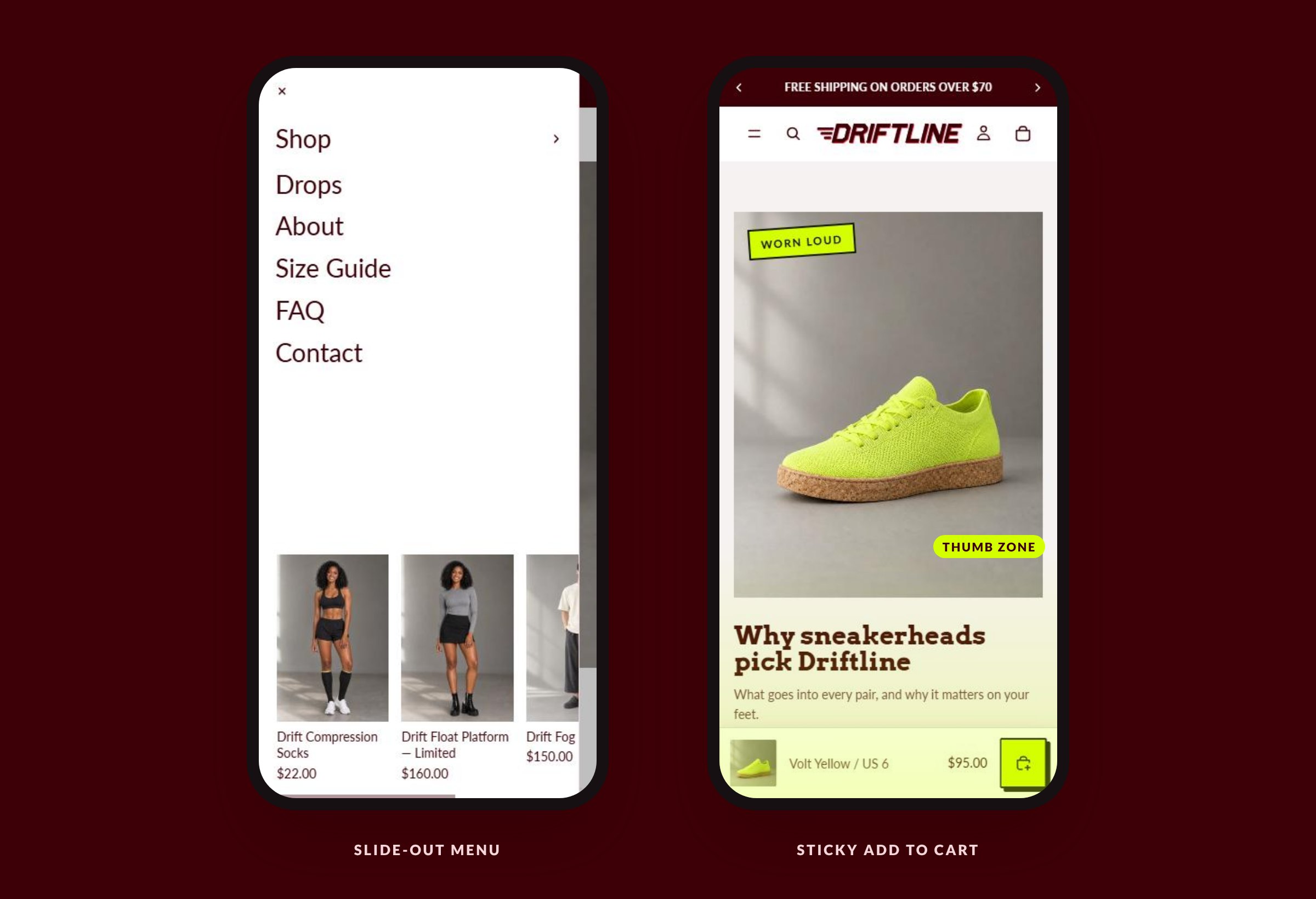
Most sneaker shoppers browse on their phones, so I designed the mobile view first. Navigation and add to cart sit within thumb reach, and a sticky add-to-cart bar follows shoppers down the product page, so buying never means scrolling back up.
Under the hood
The storefront runs on a Shopify Online Store 2.0 theme, structured so it stays fast and easy to maintain.
- Section architecture: reusable sections and blocks, so new pages are assembled in the theme editor rather than coded.
- Metafields: category, series and featured metafields mirror collection membership to power filters Shopify can't do natively, and complementary products feed the add-on toggles in the buy box.
- Performance: lazy-loaded images with responsive sizes in every custom section, and small, vanilla JavaScript only where something needs to move, like the countdown timer.
- App-free features: a drop countdown with email signup, add-on toggles, a free-shipping meter, a ships-by date, a size guide and collection filtering, all built into the theme.
Outcome
Driftline is a concept project, so there are no sales figures to report. Here's what the build delivers:
- 15Custom, merchant-editable sections
- 6Custom theme blocksShips-by date, add-ons, size table and more
- 11Page templates designed
- 0Paid apps needed
The takeaway for a brand: you don't have to choose between a bold identity and a store that's fast and easy to run.
Want a storefront that looks this unique and runs this smoothly?
Let's talk about your store.